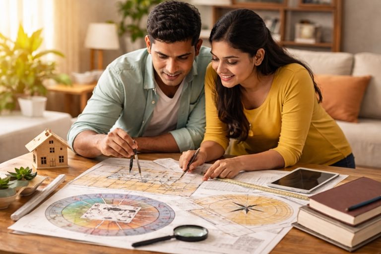
Color shapes how a home feels the moment you walk in. You notice it before furniture or décor. Some shades wake you up. Others soften your breathing. When you look at Vastu through a practical lens, color becomes one of the simplest ways to support comfort and clarity inside a space. You do not need dramatic paint jobs or complicated rituals. You only need to understand how each direction connects with fire, earth, water, air, or space, and how you can use shades that work with those elements instead of fighting them.
This guide focuses on real homes and real interiors. Apartments with odd window placements. North facing condos with huge glass walls. US homes with open kitchens mixed into living rooms. Townhouses where bedrooms fall in awkward corners. You can still create balance even if your layout is far from ideal. That is the point of using colors wisely. They adjust the mood without tearing down walls.
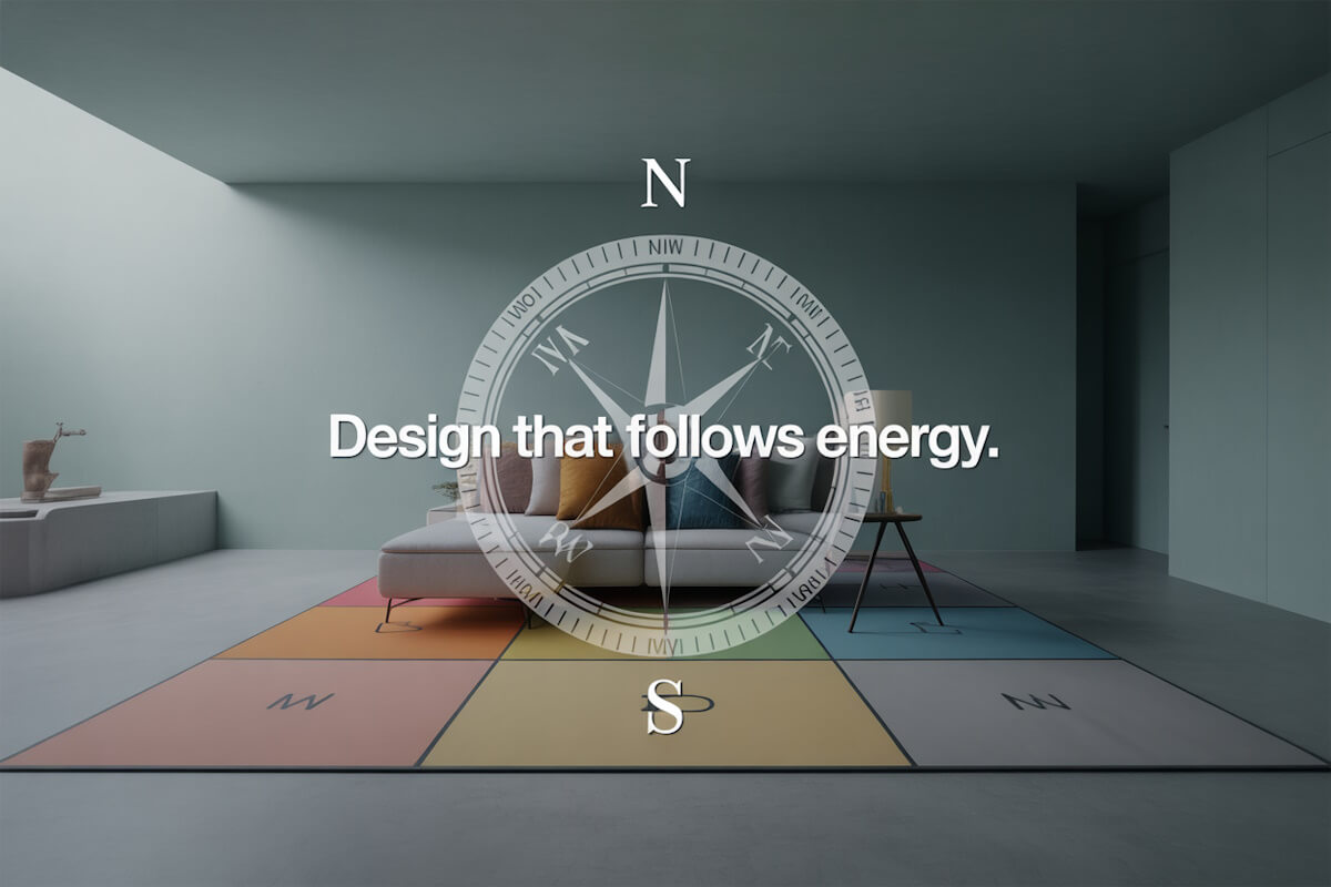
Why Elemental Harmony Matters In Everyday Homes
In Vastu, every direction holds an element. When you pair the right color with the right zone, the room feels natural. When you force an element against a direction, the space feels off. People often describe it as something they cannot explain but they sense it every time they walk through the room.
You might have felt this yourself. A bedroom that seems too intense. A kitchen that feels heavy. A study where you cannot focus. Color contributes to that. You do not need to follow tradition blindly. You just need to pick tones that help each direction do its job.
- North is water.
- South is fire.
- East is air.
- West is earth.
- Center is space.
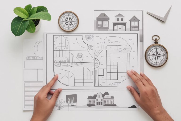
These five elements guide the main color choices. The trick is to use this map in a way that suits modern interiors where open plans blur boundaries. Let’s break it down room by room and direction by direction so you can decide what works for your home.
North Direction – Water Element
Colors That Support It
North carries the water flow of the house. You want shades that feel clear and calm. Soft blues, icy tones, silver, and cool grays work well. These shades brighten a home without pushing too much energy onto the space. In apartments where the north wall gets strong daylight, lighter blues feel balanced. In darker corners, a pale icy gray keeps things fresh without making the room feel colder.
Where These Colors Make Sense
If your living room faces north, use lighter tones on the main walls. It gives the space a smooth and steady feel. In a home office in the north zone, lighter blues help with clarity. They support focus without making the mind restless. Bathrooms in this section already match the water element, so soft aqua or gentle gray keeps them balanced.
What To Avoid
Strong red, maroon, deep orange. These trigger fire against water. It feels off visually and energetically. Many people use red décor pieces near entertainment units. If that area falls in the north, shift the strong colors to smaller accents or move them to a fire zone instead.
Northeast Direction – Spiritual and Clarity Zone
Best Colors
The northeast is sensitive. People often describe this corner as the quiet mind area. Pale yellows, off whites, cream, and very light blue feel right here. You want a gentle awakening effect.
Practical Use
If your main entry falls in the northeast, keep the foyer bright and open. In small apartments, this corner often holds a dining table. Use pale tones so meals feel calm and not rushed. Bedrooms here do best with soft shades since bold colors make the space feel too stimulating.
What To Avoid
Dark brown, charcoal, or any shade that creates a heavy atmosphere. This corner works best when it feels uncluttered in both color and layout.
East Direction – Air Element
Colors That Fit
East works well with greens, leaf tones, and warm whites. These colors feel active without being loud. They refresh the mind. Light green promotes circulation of thoughts which makes east great for study spaces, family areas, or breakfast corners.
Where To Use Them
If you have tall windows on the east wall, gentle greens look especially good with morning light. A kitchen in the east can carry green backsplashes or soft white cabinetry. For offices or kids study desks placed here, a muted green accent wall keeps the zone lively.
Colors To Avoid
Dark blue or black. These make the air element feel restricted. Heavy reds also sit awkwardly here, especially in bedrooms.
Southeast Direction – Fire Element
Suitable Colors
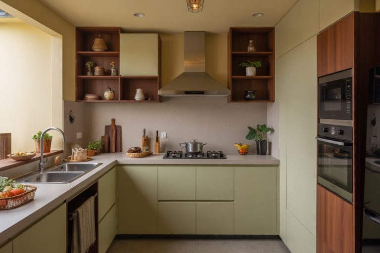
The southeast is the fire point of the house. Traditionally this is where kitchens belong. If your kitchen falls here, you can easily work with peach, coral, light orange, or soft pink. These tones support fire without making it aggressive.
Use In Modern Kitchens
Open plan kitchens in US homes often spill into living rooms. If the kitchen is southeast based on the overall layout, add fire tones in subtle ways. A coral backsplash, warm beige cabinetry, soft terracotta pots, or peach dishware can carry the fire element without overpowering the open area.
What To Avoid
Deep blues and blacks. These control fire too strongly and affect the natural warmth of the southeast. If you have dark granite, balance it with soft warm wall colors instead.
South Direction – Strong Fire Zone
Best Color Choices
South zones do well with warm tones like deep orange, terracotta, brick shades, and earthy reds. These keep the fire element steady without making the room feel restless.
Everyday Application
In many apartments, the main bedroom sits in the south. Warm terracotta or muted coral on one accent wall works better than intense red. If your living room TV wall falls in the south, earthy tones keep the energy grounded.
Avoid These Shades
Cool blues, ice grays, or steel tones. These suppress the fire element and make the room feel dull or drained.
Southwest Direction – Stability and Earth Element
Recommended Colors
Southwest loves earthy shades. Beige, tan, taupe, mud brown, and soft mustard feel stable. This zone is linked with strength and decision making. Earth tones support that weight.
Where To Use Them
Master bedrooms often fall here in single family homes. Many homeowners choose neutral palettes already, so this zone becomes naturally comfortable. Offices work well here too. Tan walls with minimal décor create a grounded atmosphere.
Avoid Colors That Agitate
Bright red or sharp orange disrupts the stable nature of the southwest. Deep black also feels too heavy here unless used in tiny accents.
West Direction – Earth and Slight Water Mix
Best Colors
West works with neutrals and mild water shades. Sandy beige, dusty gray, cream, and light pastel tones help balance the mix of elements. This direction benefits from subtlety.
Practical Use
Kids rooms in the west should stay light. Too much color intensity makes bedtime harder. Living rooms with west windows look great with warm neutrals because the afternoon light softens them.
Colors To Skip
Sharp greens or bright yellows. They clash with the grounded feel of the west.
Northwest Direction – Air and Movement Zone
Colors That Support Movement
Northwest connects with motion and change. Whites, off whites, cream, and very light gray work well. Pale beige also fits. These shades keep the zone flexible and airy.
Real Life Application
Guest rooms often land in the northwest. The soft neutral palette keeps the room comfortable for short stays. Laundry areas or utility corners in northwest benefit from a clean white look that keeps the zone feeling open.
Avoid
Strong blacks or deep browns that feel too heavy for an air-based direction.
Center Of The Home – Space Element
Suitable Colors
The center of any home should feel clear. Off white, cream, or very light beige keeps this area easy on the eye. A crowded or dark center creates confusion in how the whole home feels.
Application
Many US homes have staircases or hallways here. Keep these spots bright. Reflective surfaces or light flooring help without needing bright colors.
Combining Colors In Open Floor Plans
Modern apartments often merge living, dining, and kitchen areas into one rectangle. If those zones fall across different directions, you might wonder which color wins. The good approach is to keep the main base color neutral and use direction-based accents.
For example, if the open area stretches from east to southeast, you can keep soft white walls across the space and add green décor near the east portion while placing warm coral touches near the southeast kitchen. Rugs, curtains, wall art, or even subtle cabinetry finishes can carry the zone’s color.
This approach works well when you do not want multiple paint colors in one open room.
Handling Apartments With Limited Windows
Many condos have only two sides with windows. This means some Vastu directions stay dark. Instead of forcing bright colors everywhere, choose tones that match the direction but still feel natural with low light.
North zones with no windows can use soft icy gray instead of blue. Southwest bedrooms without sunlight do better with taupe instead of darker brown. Let the direction guide the shade, not the intensity.
Color Mistakes That Throw Rooms Off Balance
People often choose colors based on trends and then wonder why a room feels tense. Here are everyday mistakes that affect balance.
- Too much monotone in the wrong zone. For example, a navy blue living room in the south. It feels drained.
- Using heavy reds in a north facing bedroom. This creates strong discomfort during sleep because fire pushes against water.
- Painting the entire home in one theme color. A single bold shade across all directions makes the space lose its natural variation. Each direction needs its tone.
- Ignoring the center. People paint hallways dark to hide scuff marks. The center should stay light and simple.
Using Color When Renovation Is Not Possible
Sometimes you cannot paint walls. Rentals make this tricky. You can still balance zones with moveable items.
- Cushions
- Rugs
- Curtains
- Table mats
- Planters
- Artwork
- Lighting shades
- Furniture upholstery
These items carry enough color to influence a space. For example, if your northwest room has dark walls because the landlord painted them gray, you can lighten the zone with off white curtains, cream bedding, and pale décor. It brings back the airy element.
If your kitchen is north based and comes with dark cabinetry, use soft blue dish towels, silver accessories, or pale backsplashes through peel and stick tiles.
Small changes go a long way.
Choosing The Right Shade Within A Color Family
Each color family has gentle and strong versions. Choosing the wrong variation can shift the vibe.
- Blue can be calm or cold. North zones need calm, not icy discomfort.
- Green can be refreshing or neon. East zones work with natural greens, not bright synthetic tones.
- Red can be grounding or overwhelming. South zones need earthy reds, not harsh scarlet.
- Yellow can feel warm or sharp. Southwest does better with mustard tones instead of bright sunshine yellow.
When in doubt, lean toward muted versions. Muted shades blend better with furniture and flooring, especially in US homes where wood tones vary widely.
Vastu Color Tips For Common Problem Areas
North Toilet
People worry about this because water on water creates excess flow. Keep the walls light gray or icy blue and avoid black. Add silver hardware. Do not use heavy décor.
Southwest Kitchen
This is a fire element placed in an earth zone. The key is to settle the fire. Use beige, cream, or warm brown. Add small coral touches if needed but keep them minimal.
Bedroom In Southeast
This is common in apartments. Since southeast is fire, bedrooms feel heated. Use light pink or soft beige on walls. Keep red décor low. Add more white or cream to reduce the intensity.
West Facing Living Room
Afternoon heat makes this room feel heavy. Neutral tones pair better than dark shades. Off white, dusty gray, or warm beige keeps things steady.
Northeast Bathroom
Keep it pale. Cream or light yellow. Avoid deep tones entirely.
How To Pick Colors When Family Members Have Different Preferences
You can blend personal choices with Vastu guidelines. Start by keeping the main walls direction friendly. Then let personal preferences appear in bedding, décor, or small accent items.
For example, if a child wants bright blue in a south bedroom, paint the walls in warm beige and use bright blue bedding or décor pieces. The main direction color stays intact and the child gets the room they want.
It is a simple compromise that works in every direction.
Color And Mood In Everyday Living
Vastu or not, colors shift how you feel daily. When you match them with the natural element of the direction, the room feels easier to use. You do not feel drained or restless. You sleep better. You focus better. You communicate easier. These changes show up in small ways but they add up.
Think of color as a support system for the house. Not strict rules. Not superstition. Just balance.
Final Thoughts
If you follow Vastu in a practical way, color becomes your best tool. You do not need to repaint the whole house. You just need to understand how each direction works and use shades that support it. Look around your home and check where each room falls. Focus on the main walls first. Then use small items to correct what you cannot change.
Start with one room. Make small improvements. You will notice the difference faster than you expect.