Colors are much more than mere aesthetic choices for our walls or decor. They are specific frequencies of light that exert a profound psychological and physiological influence on the human mind. In the realm of spatial science, the relationship between vastu zones and colors is a fundamental pillar for creating a home that resonates with health, wealth, and emotional stability. When you align the color palette of your home with the directional energies of the Earth, you essentially tune your living space to a higher frequency of harmony.
Selecting the right hues involves understanding how different directions interact with the five primary elements: Water, Air, Fire, Earth, and Space. For homeowners and real estate investors, recognizing these patterns is the first step toward a balanced lifestyle. A home where colors conflict with the underlying directional energy often manifests as persistent stress, financial instability, or health concerns. Conversely, a space synchronized through a thoughtful vastu color chart can become a powerhouse of productivity and peace. This guide provides a detailed roadmap to navigating these energetic zones with confidence and clarity.
The Core Philosophy of Vastu Zones and Colors
Before diving into specific colors, it is essential to understand why certain hues are prescribed for specific areas of the house. The logic is grounded in the Pancha Tattva, or the five elements, which govern different compass points. Each element has a corresponding color family that supports its natural flow. For instance, the North is associated with the Water element, which finds its balance in shades of blue and black. Introducing a Fire element color, like bright red, into a Water zone creates an energetic conflict that can disrupt the peace of the household.
The 16 Vastu Zones and Elemental Balance
While traditional Vastu often focuses on the eight primary directions, advanced practice utilizes the 16 vastu zones to achieve surgical precision in energy management. Each of these sixteen zones governs a specific aspect of human life, such as social connectivity, health, or financial gains. By applying the correct colors in these micro-zones, you can fine-tune the environment to support your personal and professional goals. Understanding this elemental grid is the foundation of any professional Vastu assessment.
The Role of Light and Pigment in Spatial Energy
Light is the carrier of color, and the way natural sunlight enters different parts of your home changes the impact of the vastu zones and colors applied there. Morning light in the East is invigorating and supports green and brown tones, whereas the afternoon sun in the West is more intense, making white and metallic shades more appropriate for maintaining a calm atmosphere.
Detailed Breakdown of the 16 Vastu Zones and Colors
Each of the 16 vastu zones requires a specific color treatment to ensure that the energy of that zone remains vibrant and supportive. Let us explore the directional requirements and the recommended vastu color chart for these areas.
The Water Element Zones: North, NNE, and NE
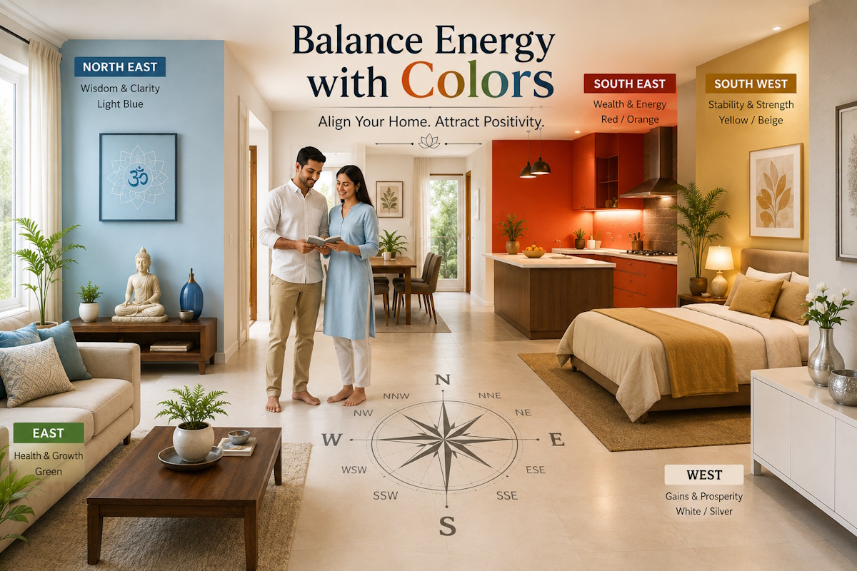
The Northern sectors of your home are primarily governed by the Water element. This area is the gateway for opportunities and wealth. The North zone itself thrives on blue, black, and silver. Moving slightly toward the North-North-East, which is the zone of health and healing, light blue or pale shades of green are highly effective. The North-East, the zone of mental clarity and wisdom, should ideally be kept in shades of blue or very light metallic tones. Avoid using reds or deep yellows here, as they can lead to mental clutter and health issues.
The Air Element Zones: ENE, East, and ESE
The East and its neighboring zones are dominated by the Air element, which represents growth and social associations. The East zone responds best to shades of green and light brown. For the East-North-East, which governs refreshment and joy, vibrant greens or even light minty shades work wonders. However, the East-South-East is a zone of churning and anxiety if imbalanced, so using very light cream or mild green is advisable here to keep the energy stable. Following a precise vastu color chart for these zones helps in maintaining strong social networks and a refreshed mind.
The Fire Element Zones: SE, SSE, and South
Fire is the energy of transformation, cash flow, and confidence. The South-East is the primary zone for liquidity and fire, making red, pink, orange, and purple the ideal choices. The South-South-East, the zone of confidence and power, also benefits from deep reds and maroons. The South zone itself is the area of relaxation and fame, where red or shades of light pink help in building a strong reputation. It is critical to avoid blue or black in these zones, as water extinguishes fire, potentially leading to financial losses or lack of motivation.
The Vastu Color Chart for Earth and Space Zones
As we move toward the Southern and Western parts of the home, the elemental dominance shifts toward Earth and Space, requiring a completely different palette to ensure stability and gains.
The Earth Element Zones: SSW and SW
The South-West and its adjacent South-South-West zone are the foundation of your home. The South-West governs relationships and skills, and it is best represented by yellow, beige, or golden hues. These colors provide the stability required for long-lasting bonds and professional mastery. The South-South-West is the zone of disposal and expenditure, where yellow or light cream helps in managing the energy of letting go. Using red in the South-West can cause friction in relationships, while blue can lead to instability in the family structure.
The Space Element Zones: WSW, West, WNW, and NW
The Space element represents expansion and support. The West-South-West is the zone of education and savings, benefiting from yellow or white. The West itself is the zone of gains and profits, where white, silver, or grey are the most effective colors. The West-North-West, which is the zone of detoxification and releasing emotions, should be kept in white or very light grey. Finally, the North-West zone of support and banking thrives on white and cream tones. The North-North-West, the zone of attraction, can handle white combined with light blue or silver accents.
Practical Application: A Room-by-Room Vastu Color Guide
While the 16 vastu zones provide a scientific grid, applying these to specific rooms requires a blend of Vastu logic and functional design. Each room serves a different purpose, and the colors should reflect both the zonal energy and the activity performed there.
The Living Room: A Hub of Energy
The living room often spans multiple vastu zones. The ideal approach is to identify the primary zone the living room occupies and choose a dominant color from the vastu color chart for that area. Generally, neutral tones like cream, off-white, or light beige are safe choices for living rooms as they are welcoming and do not disrupt most directional energies. You can then use accent walls or decor in the specific color of the zone to enhance positive vibrations.
The Kitchen: Balancing the Internal Fire
The kitchen is most often located in the South-East or North-West. If it is in the South-East, shades of red, orange, or pink are excellent. If the kitchen is in the North-West, white or light cream is better. Regardless of the zone, avoid using black or dark blue for kitchen platforms or cabinets, as these colors represent the water element and can conflict with the kitchen’s inherent fire energy, potentially affecting the health of the residents.
The Master Bedroom: Stability and Peace
For a master bedroom in the South-West, yellow or earthy tones are the gold standard. They provide the grounding energy needed for a stable marriage and restful sleep. If the bedroom is in the South, light pink or peach can enhance the sense of relaxation. Avoid using bright, high-energy colors like neon red or dark blue in the bedroom, as they can interfere with the quality of sleep and emotional peace.
Correcting Vastu Doshas Using Color Therapy
In many modern apartments, it is not always possible to change the layout or move walls. This is where the science of vastu zones and colors becomes a powerful tool for remediation. Color is one of the most effective non-invasive remedies for Vastu imbalances. By painting a wall or adding specific colored decor, you can “treat” a zone that is currently occupied by an incompatible room or entrance.
Treating an Improperly Placed Toilet
A toilet in the North-East or South-West is considered a major Vastu dosha. While structural changes are best, you can mitigate the impact using color. For a North-East toilet, using light blue tones and adding wooden elements can help. For a South-West toilet, painting the walls in a dull yellow or beige and using yellow floor mats can provide a level of grounding that counteracts the negative drainage of energy.
Neutralizing the Impact of Wrong Entrance Colors
The entrance of your home is where energy enters. If your door is in a North zone but painted red, it may be blocking opportunities. Changing the door color to blue or silver, or even adding a small strip of that color at the base, can significantly improve the flow of wealth. The vastu color chart serves as a guide for these quick but impactful corrections that do not require major renovations.
Creating a Roadmap for Your Home’s Energetic Balance
Balancing vastu zones and colors is a journey of understanding your space and how it interacts with your life. The goal is not just to follow a set of rules, but to create an environment that feels naturally supportive and vibrant. When the colors on your walls align with the elemental forces of the directions, you create a resonance that can lead to significant improvements in your health, career, and personal relationships.
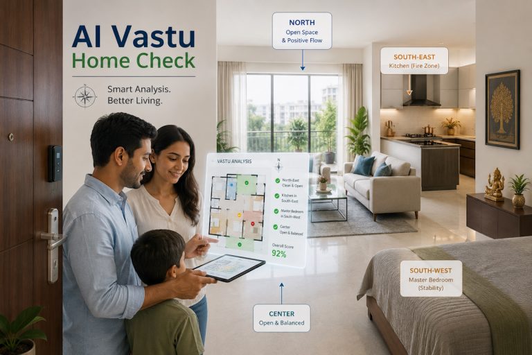
Start by evaluating one room at a time. Use a compass to identify the 16 vastu zones within your home and compare the current colors with the vastu color chart. You might find that a simple change in the color of a rug, a set of curtains, or an accent wall is all it takes to shift the energy from stagnant to flowing. Vastu is a practical science, and when applied with precision, it serves as a silent partner in your success.
For those who want a comprehensive and data-driven approach to their home’s energy, Vastu Consult offers specialized services that bridge traditional wisdom with modern living. Whether you are moving into a new home or looking to revitalize your current space, professional guidance ensures that every color choice you make is a step toward a better life.
Frequently Asked Questions
1. Can I use wallpaper instead of paint for Vastu colors?
Yes, wallpaper is an excellent way to introduce specific colors and patterns into a zone. Ensure the dominant color of the wallpaper matches the zonal requirement.
2. What if my room spans two different Vastu zones?
In such cases, identify which zone contains the majority of the room or where the most significant activity takes place. Use the color of that dominant zone, or use a neutral base with accents from both zones.
3. Are dark colors bad in Vastu?
Not necessarily. Dark colors represent depth and intensity. While light colors are generally preferred for a sense of space, a dark blue in the North or a deep red in the South-East can be very effective if used strategically.
4. Does the ceiling color matter?
Yes. In most cases, the ceiling should be kept white or a very light off-white. This represents the element of Space and allows for a sense of openness and upward energy flow.
5. Can I use many colors in one house?
It is better to have a cohesive flow. While different zones require different colors, try to use shades that complement each other to avoid a fragmented or chaotic feeling in your interior design.